
Technical Analysis
Technical analysis is a way of using market data to predict the future of the stock market. Many of the principles of technical analysis have been developed over several hundred years of watching the stock market and other markets as well.
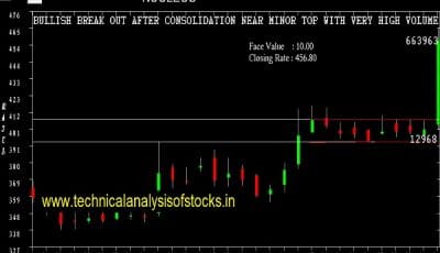
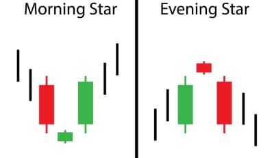
The oldest known form of technical analysis is known as candlestick analysis. Once used to predict rice prices, candlestick analysis is a method invented in the early eighteenth century. It remains one of the main methods of predicting stock prices today.
Another common form of technical analysis is known as Dow Theory, which was invented by Dow Jones founder Charles Dow. This technique is considered the precursor to many modern techniques. Elliott wave theory is another common technical analysis technique. However, in the recent past, more and more technical analysis has been performed by computer programs specially for the job.
Regardless of the type of technical analysis, the intent is the same: to identify trends in the stock and other financial markets, and to use these trends to predict the rise or fall of the market in question. Many of the people who employ these techniques will look for patterns such as the head and shoulders reversal pattern or flags.
People who employ technical analysis are generally known as market analysts. Because there are many schools of technical analysis, many traders are familiar with a variety of techniques and use them all to get a comprehensive picture of where the market is at and where it is headed. However, there remain many traders who are loyal to a single method.
Charting
When it comes to predicting the movement of financial markets, there is no tool as valuable as charting. Charting is basically the art of writing out the pattern of a stock price so the analyst can identify patterns and use them to predict any future movement. There are three major types of charting.
- Line charts: This is the simplest type of chart. In these, the closing price of the stock is plotted on a graph, with a line connecting each interval. These are good for showing overall trends, but not as effective for predicting movement simply because of the lack of information in the chart.
- Open High Low Close charts: Also known as OHLC, these charts are a little more complicated than line charts. They give more information, however, showing the opening and closing prices horizontally while the high and low of the day are plotted vertically.
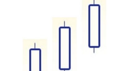
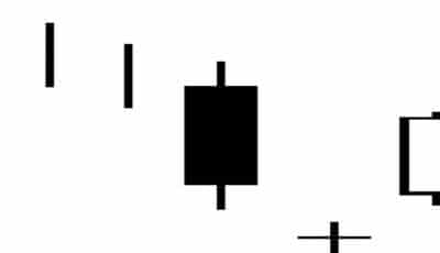
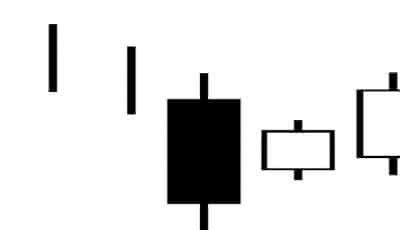
- Candlestick charts: These are like OHLC charts in that they show the opening and closing prices as well as any high and low movement throughout the day. However, these are shown entirely on a vertical access, with the range of trading outside these parameters represented by ‘wicks’. In candlestick charting, a day that closes higher than it opened is represented by a white or blue candle, while days that close lower than they opened have a black or red candle.
Many traders prefer candlestick charts because they are easy to understand and have two hundred years of tradition behind their predictions, making them a more diverse and stable predictor. However, all charting has a place and a purpose, and there are pros and cons to every type of chart.